For my first ever client project, I undertook the challenge of creating a full-scale mural for the Vitacress factory located in Chichester. I had never created anything along these lines beforehand but I was up to the challenge as the opportunity to make use of the creative freedom given to create a vibrant piece of artwork appealed to me.
Brief
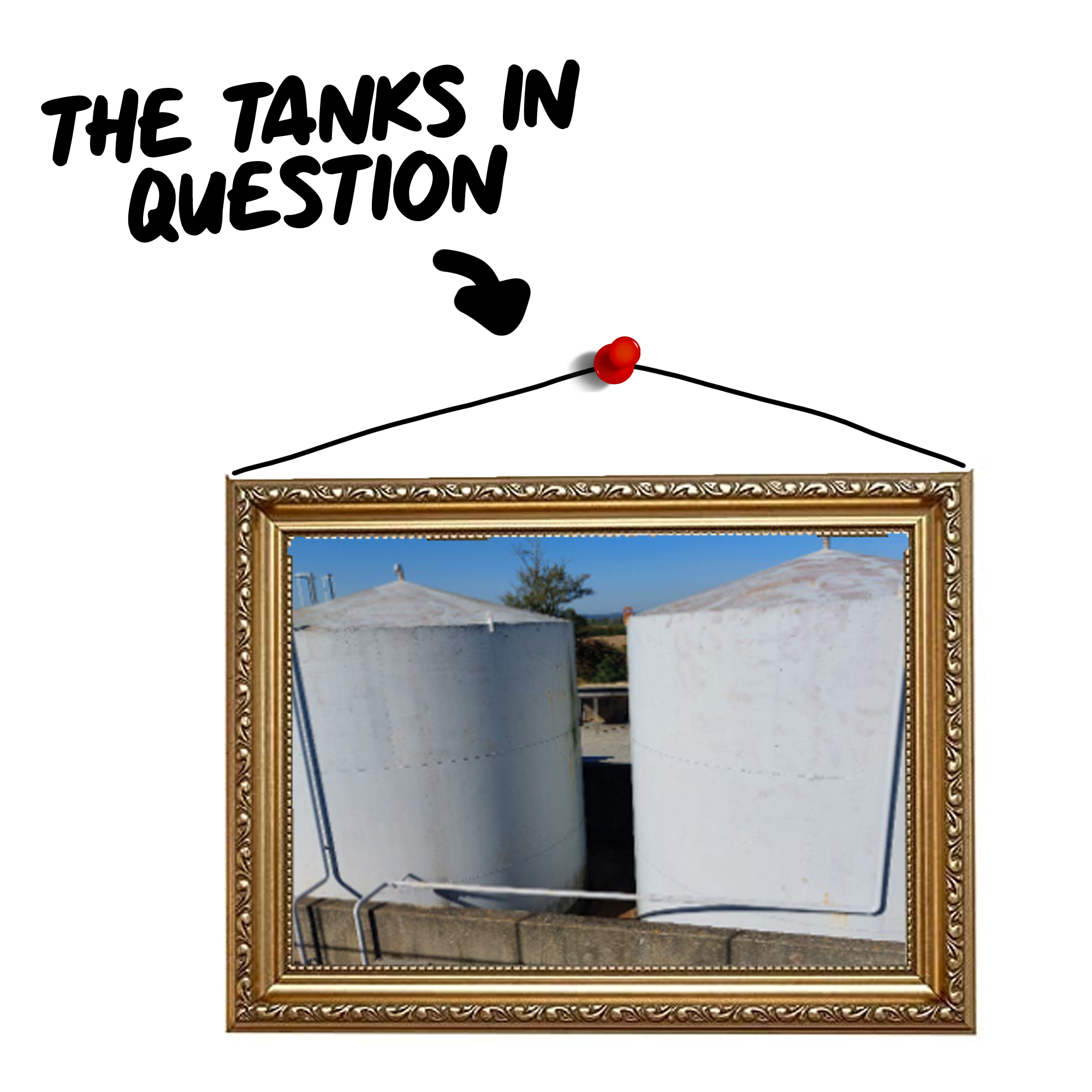
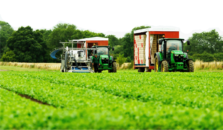
The brief we were given was to design artwork for the large vessels they had located at the Chicester site, although it later turned out that it would only be one of the tanks we would be creating the art for alongside the bund wall that wrapped around it. The target audience for the mural would be the on-site workers at the Vitacress farm to make their surroundings more attractive when they are looking out the window in the cafeteria. My initial idea was to create something bright and visually pleasing to look at whilst they eat their lunch to help brighten up the workers’ day during long shifts. A lot of creative freedom was given to us by the client, all they asked is that we include some form of ‘Trompe l’oeil’ in our work and that we take the Vitacress brand of into consideration.
Research
This was originally meant to be a group project but became a solo project after everyone given the brief realised it would be easier to create separate pieces of work for the client rather than trying to collaborate on a single art piece. The first part of the brief I researched was the “Trompe l’oeil” as I originally had no idea what it meant, I found out it is the name given to a flat piece of artwork with a 3D optical illusion effect such as a window that appears to look out over some beautiful scenery or something appearing to be breaking out from the surface being painted on. Alongside this, I also researched the Vitacress brand as I knew the artwork has to relate to and represent the brand in some shape or form. I looked into their official website and found out they were a herb-based business, being one of Europes leading suppliers of fresh produce such as watercress and salads with farms all over Europe. This started sparking ideas of how I needed to create a nature-themed mural and also include more specific Vitacress-related attributes if possible, but also make it enjoyable for the workers to look at in order to lift their moods during a hard-working day.
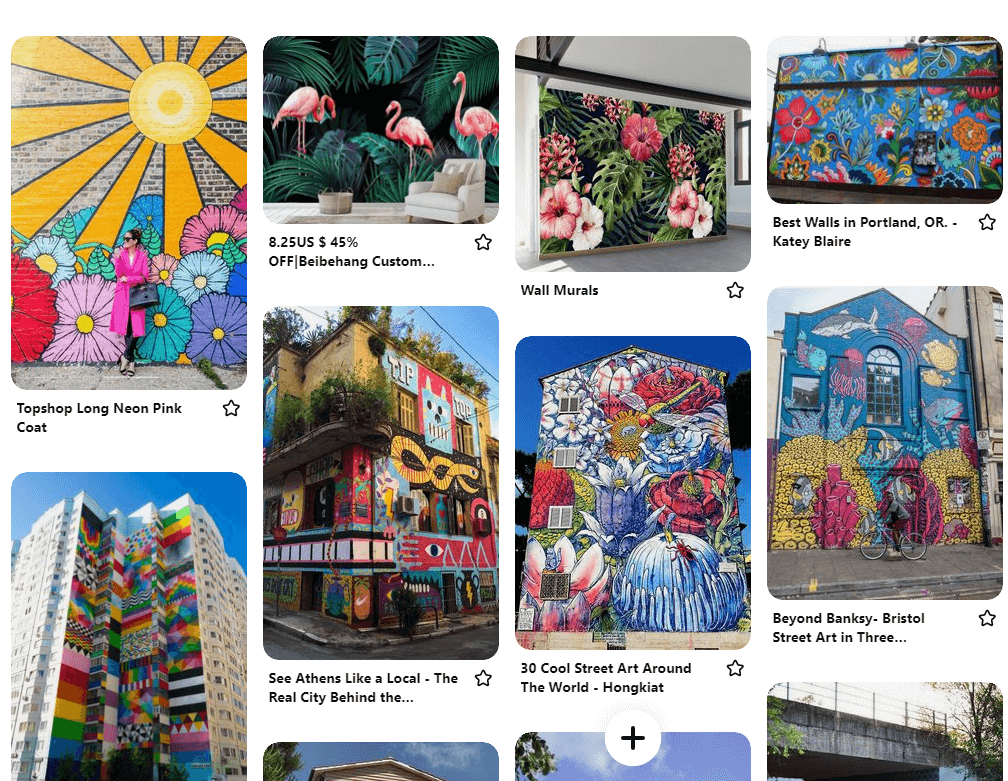
The majority of research in terms of ideas and inspiration for the actual artwork itself was conducted on Pinterest, to me this is the best platform to get inspiration for art-based projects as you can find a wide variety of results even when you are searching for something specific, which is this case was nature-based artwork and murals. When I searched ‘Nature murals’ into the browser the results heavily showed the theme of using flowers as the main focus of the piece as they can be designed to be bold vibrant and eye-catching, so I knew it would be a smart idea to include them in my own personal design and experiment with different shapes, sizes and colours. The designs with high levels of greenery also caught my eye as I knew this would be my main colour since it fits the Vitacress brand perfectly with it being the most prominent colour in nature, the use of trees, herbs, grass etc. could be used effectively to create an aesthetically pleasing nature-themed mural. I took inspiration from different murals to create different elements I could include in my piece, for example, animals were a prominent theme across a lot of designs so I created a handful of different animal designs to put on the mural. I also used Pinterest to find different ideas for Trompe l’oeil designs, the most popular designs I thought worked the best were windows and archways leading to scenic views which is another idea I took into consideration when planning designs for the mural.
Planning/Process
With this mural being my first reak client project, I knew I had to spend a lot more time planning and sketching out different ideas before making any starts with the actual artwork. I began by drawing different trompe l’oeil designs as I knew that was something they made clear that they wanted to prioritise when it came to the design. The first idea I came up with was a window that would give the illusion that there was some sort of scenic view behind the tank, I really liked the window idea so I stuck with it and developed it in different ways such as changing the style of the frame and also played with the idea of stuff coming through the window. The ideas of views I came up with that would work well with the theme they wanted included cress fields, a forest, a seaside view or simply just clouds in the sky. Another idea that appealed to me from researching different Trompe l’oeils was the illusion of making the tank appear as if it had been broken and something from inside the tank was emerging from inside it such as cress or vines.
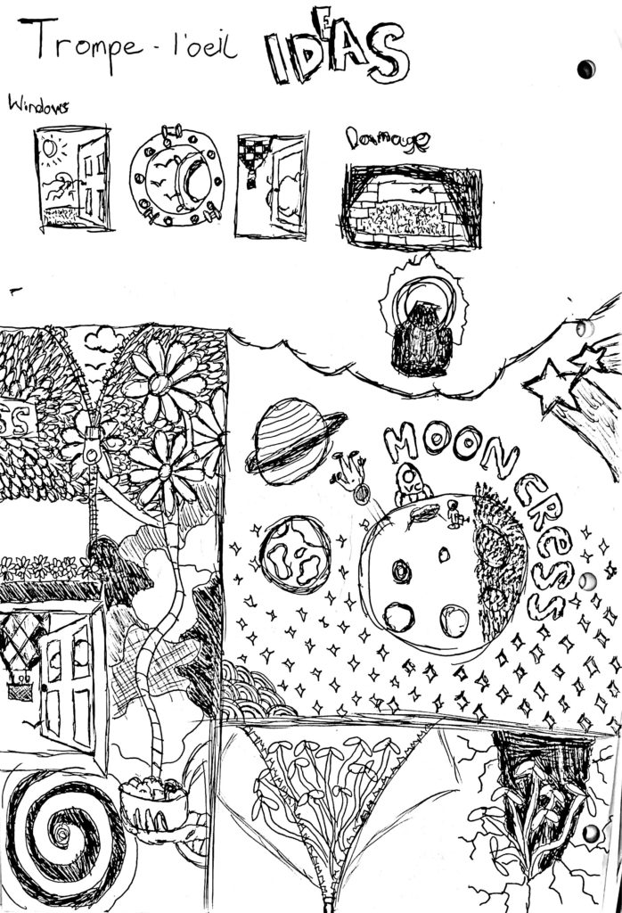

I then took a second approach to creating ideas and started thinking of scenes I could create to cover the whole tank with one single image rather than a collage of different assets which is what I was originally thinking of doing. My first idea was a seaside theme which would present a cress field in the foreground to represent the brand, which would overlook a beach and sea scene. I knew this could be a simple yet effective design if I carried it out well but I also wanted my piece to have a bit more creativity behind it. I designed another scene which would show crates of cress being delivered to the moon and a farm being set up on it. I liked this idea as it obviously fitted with the brand but was also out of the box and something the workers might get more enjoyment out of looking at, there was also a chance the client would be more impressed with the creativity behind it.
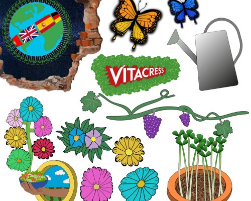
However neither of those designs was the route I ended up taking. I was conflicted when it came to choosing what single scene i’d want to design as I had many other ideas in my head of what I wanted to incorporate, so I went back to my original plan and went about it by creating a collage of assets so I could include as many ideas as possible. I began creating a collage-type piece featuring a assortment of different nature-related assets I would create using Illustrator and Photoshop, this also suited my personal aim to improve and become more comfortable with using Illustrator which I could do by creating a variety of designs. With a combination of online tutorials and my own freehand designs, I was able to create enough assets to incorporate in to a whole complete mural.
Final Designs
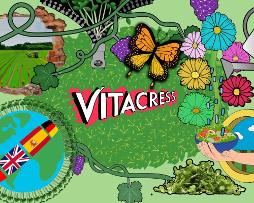
Based on very positive feedback from my peers after showing them my planned sketches, the trompe l’oeil image of the hand reaching through the window appeared to be my best idea so I began to create a design with that as the main feature. I also liked this idea as there was a lot of versatility that could come with it, I knew I could have a range of hands reaching though and interacting with the nature related assets I had created such as flowers, herbs and butterflies. I used the leaf pattern for the background to cover the base of the tank as it was a subtle yet fitting pattern which I found perfect for the background of the design I was creating.
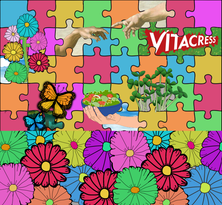
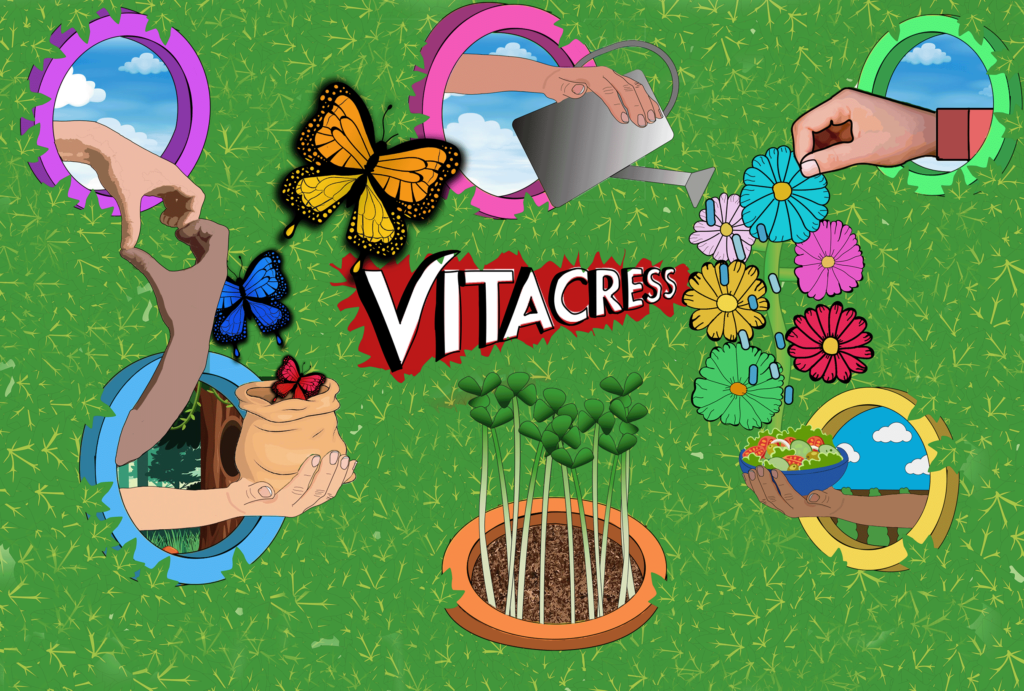
I also created a second mural design because I liked to give the client more than one option to choose from, I used a lot of the same assets but this time I created a jigsaw-style image. The trompe l’oeil effect was provided by the different assets appearing out from behind different gaps in the jigsaw. This design wasn’t as strongly nature orientated as the other design but it was much more vibrant which would be more bright and fun for the workers to look at during the course of their day, which is the main purpose of the design which I kept in mind. I used the same design for the surrounding bund wall as the other design as the colour scheme fitted well with the tank design.
I am very pleased with the way both of my designs have turned out in the end, I made effective use of my research into both the company and the brief given to me to create 2 nature-related pieces of art that I like to think would brighten up the workers days a little more. As of right now I have not heard back from the client but they have assured they will be in touch.